PACKAGING & PRODUCT
We open and close packaging everyday and more often than not, don't stop to actually look at it.
Packaging is used to protect items, display products and when done well, grab and engage the consumer to
purchase or interact with the product and its contents.
Packaging design is an area of interest for me, both in terms of thinking outside the box (pardon the pun)
and in terms of fitting the purpose of the product its designed for. Here are examples of work I've
conceptualised, developed and completed.
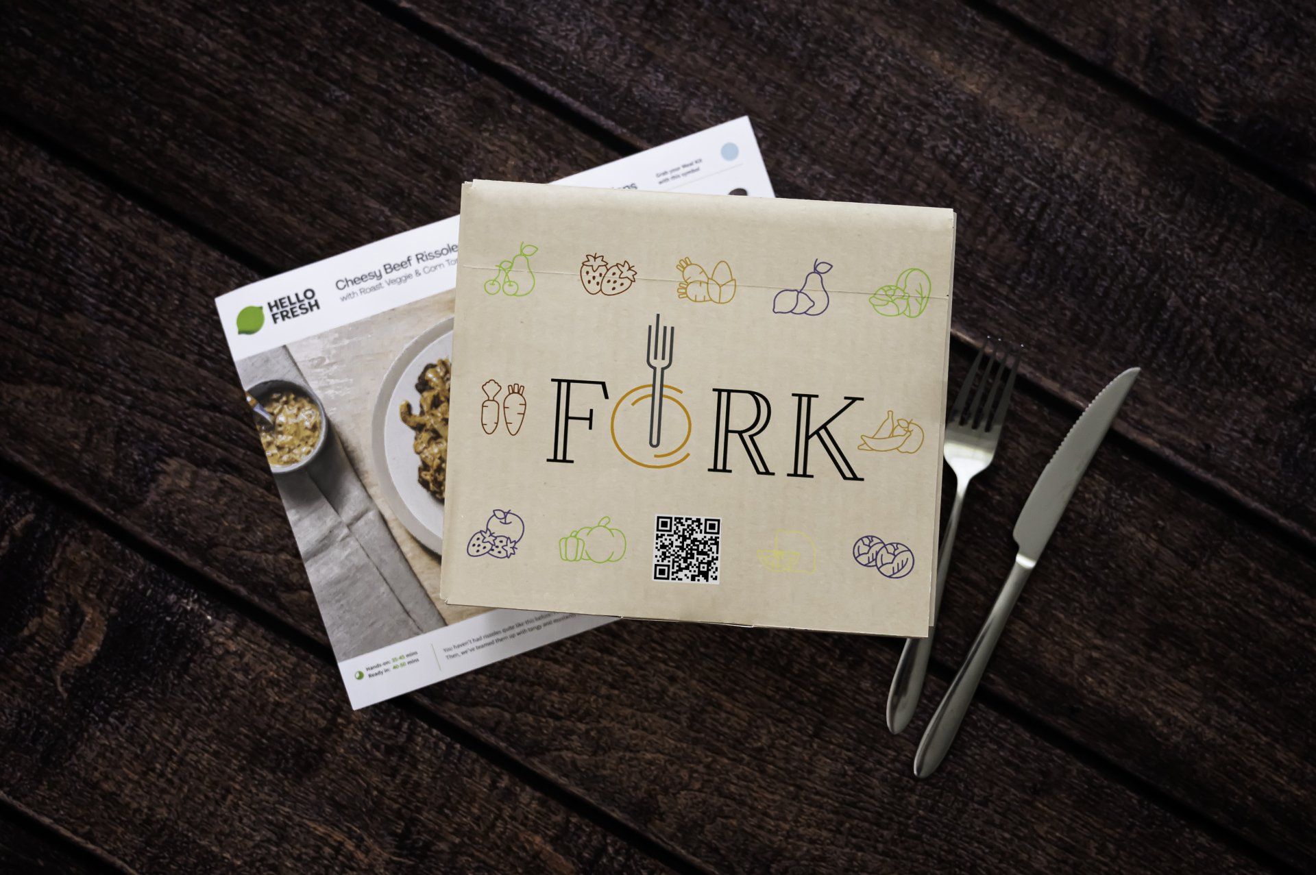
HELLO FRESH - PACKAGING REDESIGN
I started ordering Hello Fresh in mid 2021 - mostly for convenience but also because I didn't want to have to think about what to cook for dinner each night. However as a designer, I very quickly got frustrated with it!!
Part of the role of packaging is to protect the items inside, and the way in which Hello Fresh packaged their ingredients meant that they were often bruised, squashed, spilt or broken. The recipe cards were bent and the idea of Hello Fresh became unappealing and frustrating.
So.....I did what a designer does and redesigned the packaging. The new packaging was created under the brand "Fork" where "we give a fork about your food" and provide "Food for Fork". The play on words was a fun idea to work under.
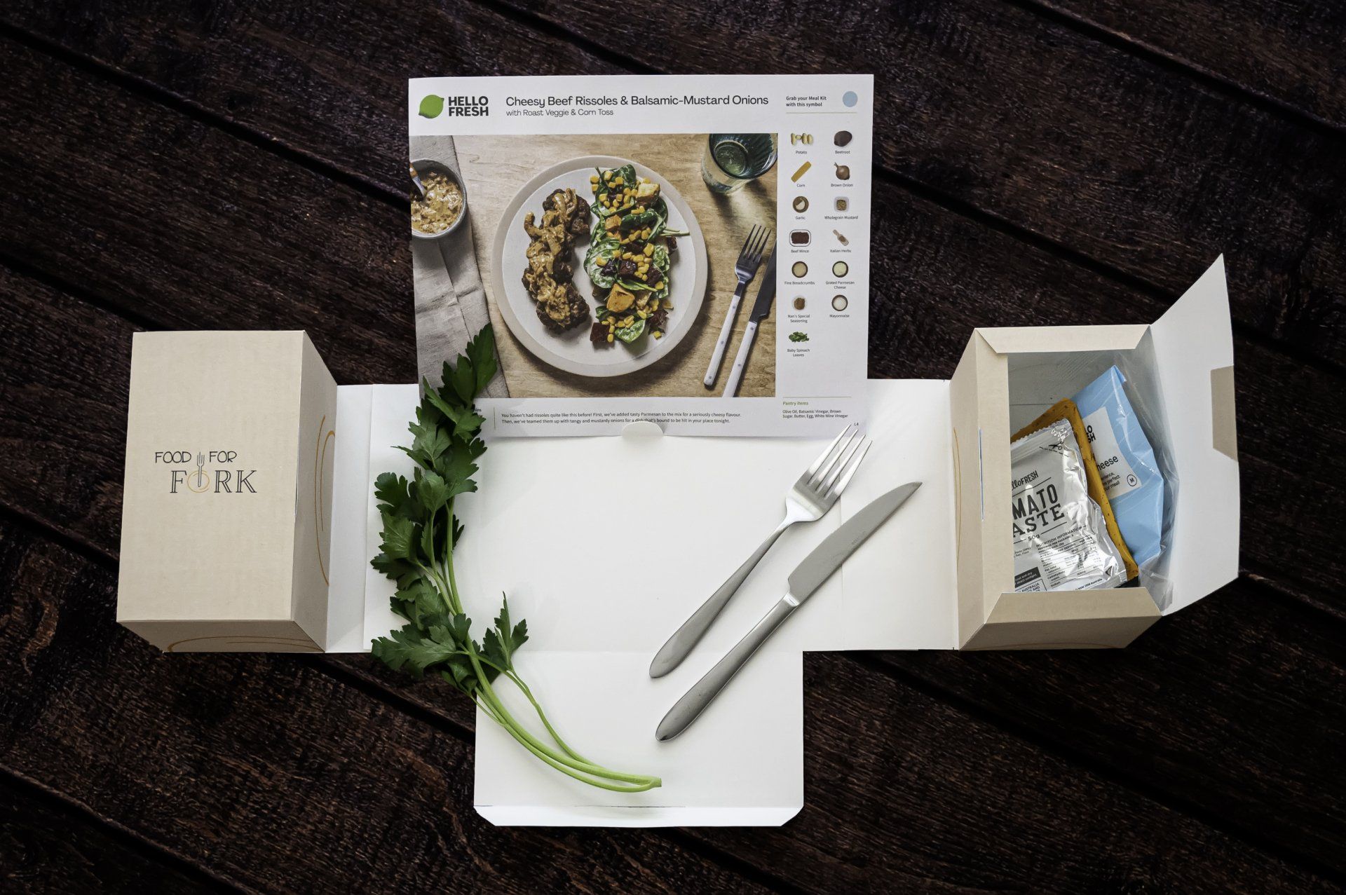
The final packaging is a compact box that protects the ingredients, folds out into two containers (one lined for refrigerated goods), has a little stand for the recipe card to stand up, and contains a lined section in the center for the preparation of ingredients. The idea being that you can pick up the box and take it where you want and have what you need to prepare your items for cooking.
The prototype below shows this functionality and is created out of a light card stock. The design is ready for sending to a printer for creation and die cutting using thicker corrugated cardboard and produced at a slightly larger size.
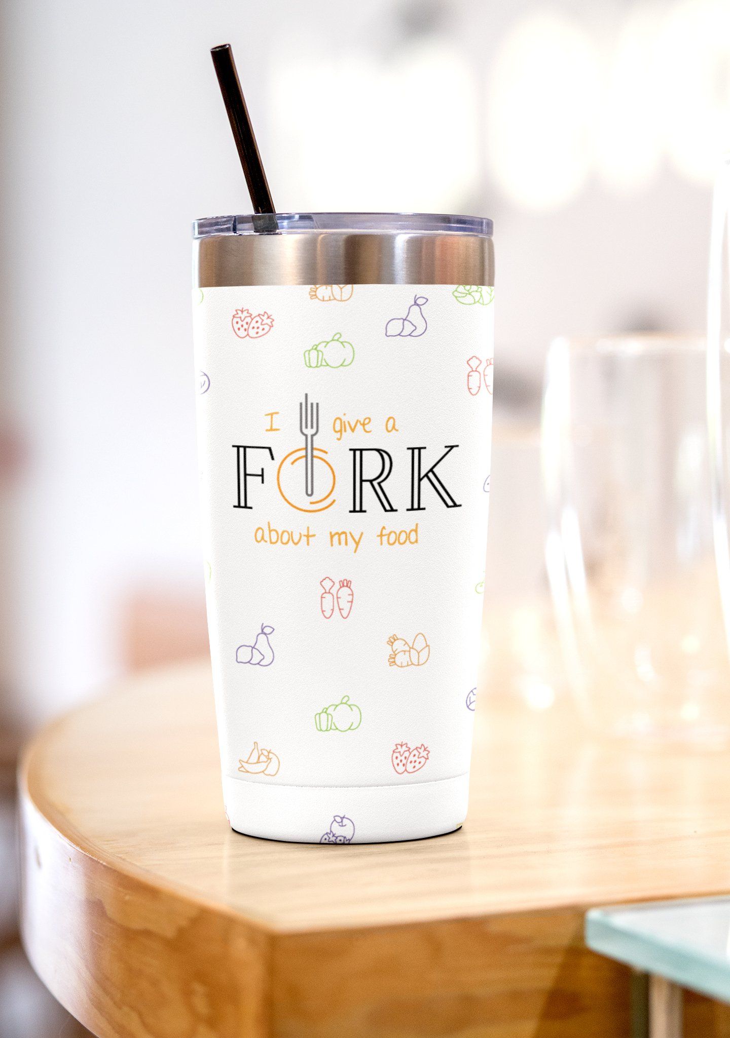
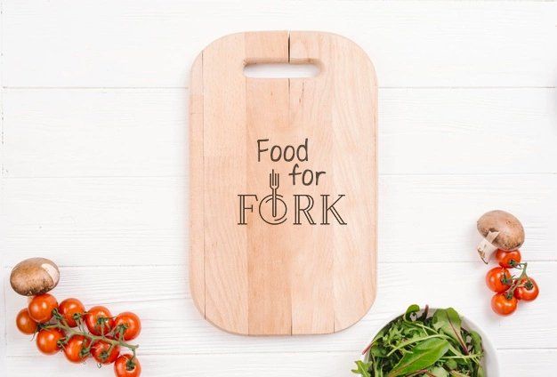
Additional collateral materials that complement the brand and concept was also created as a bit of fun.


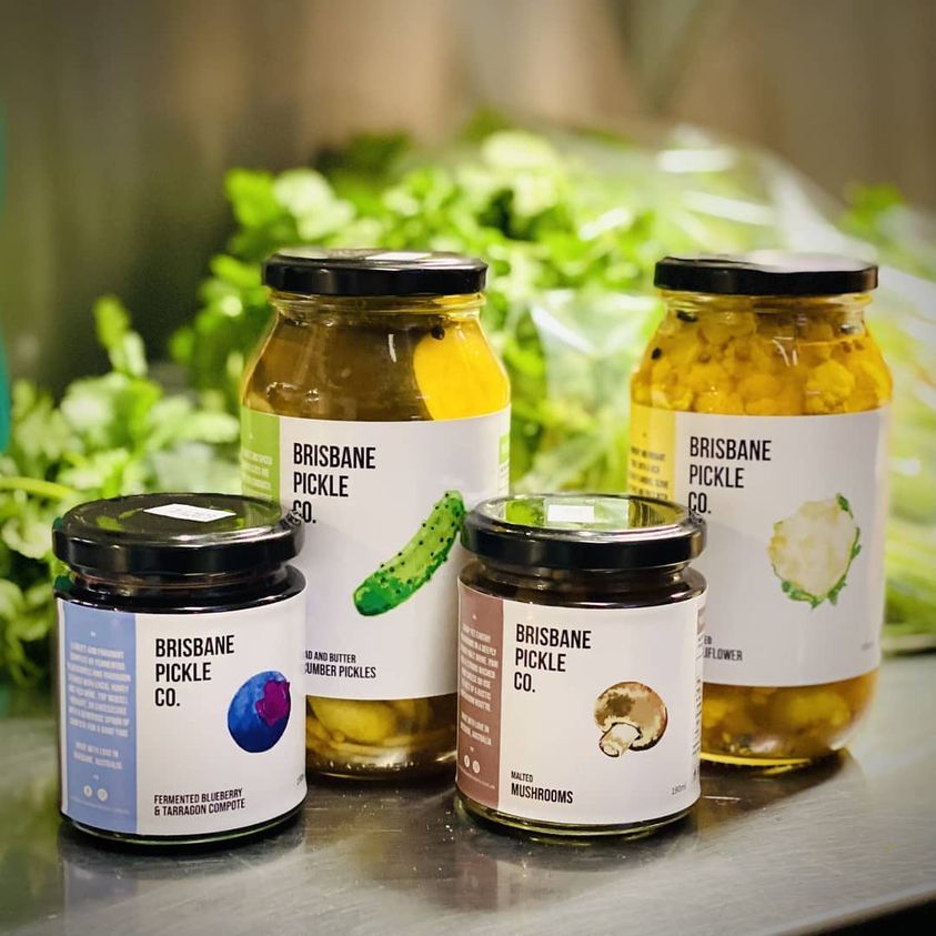
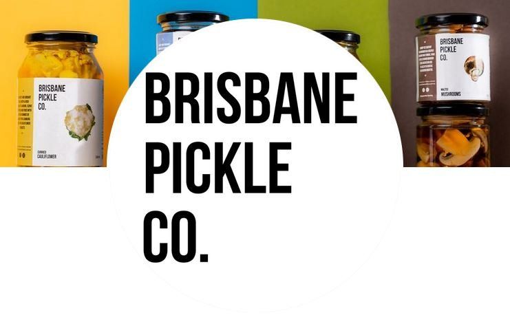
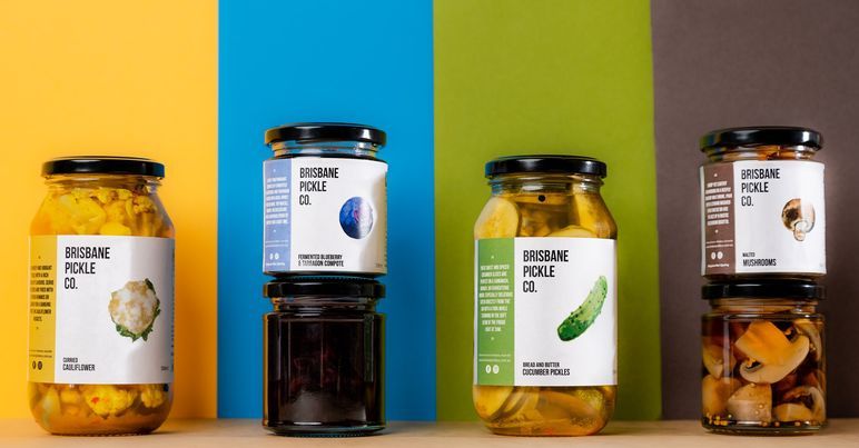
BRISBANE PICKLE CO.
When Brisbane Pickle Co. came to me with his existing jar labels and told me that they had a problem (i.e. they needed new labels), I was determined to assist. Being a small family run business, it was important to find an affordable and simple solution.
The labels not only needed to be robust enough to stand cold and wet conditions in the refrigerator but they also needed to fit the existing jars in stock. They also needed to be cheaper and quicker than the previous supplier.
AND the design needed to be recreated to fit.
In the end, I created 10 different label styles for various sizes of products and was able to save Brisbane Pickle Co. a decent chunk of profits in the meantime. The final result - a delicious product that also looks great on the shelf.
Images courtesy of
Brisbane Pickle Co FaceBook page. Work completed as part of a graphic design position at Rogue Print and Mail.
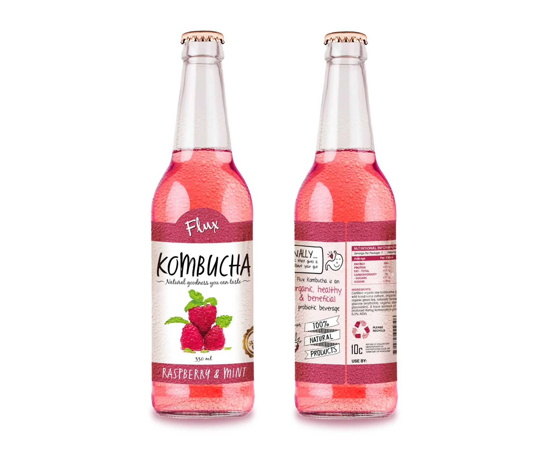
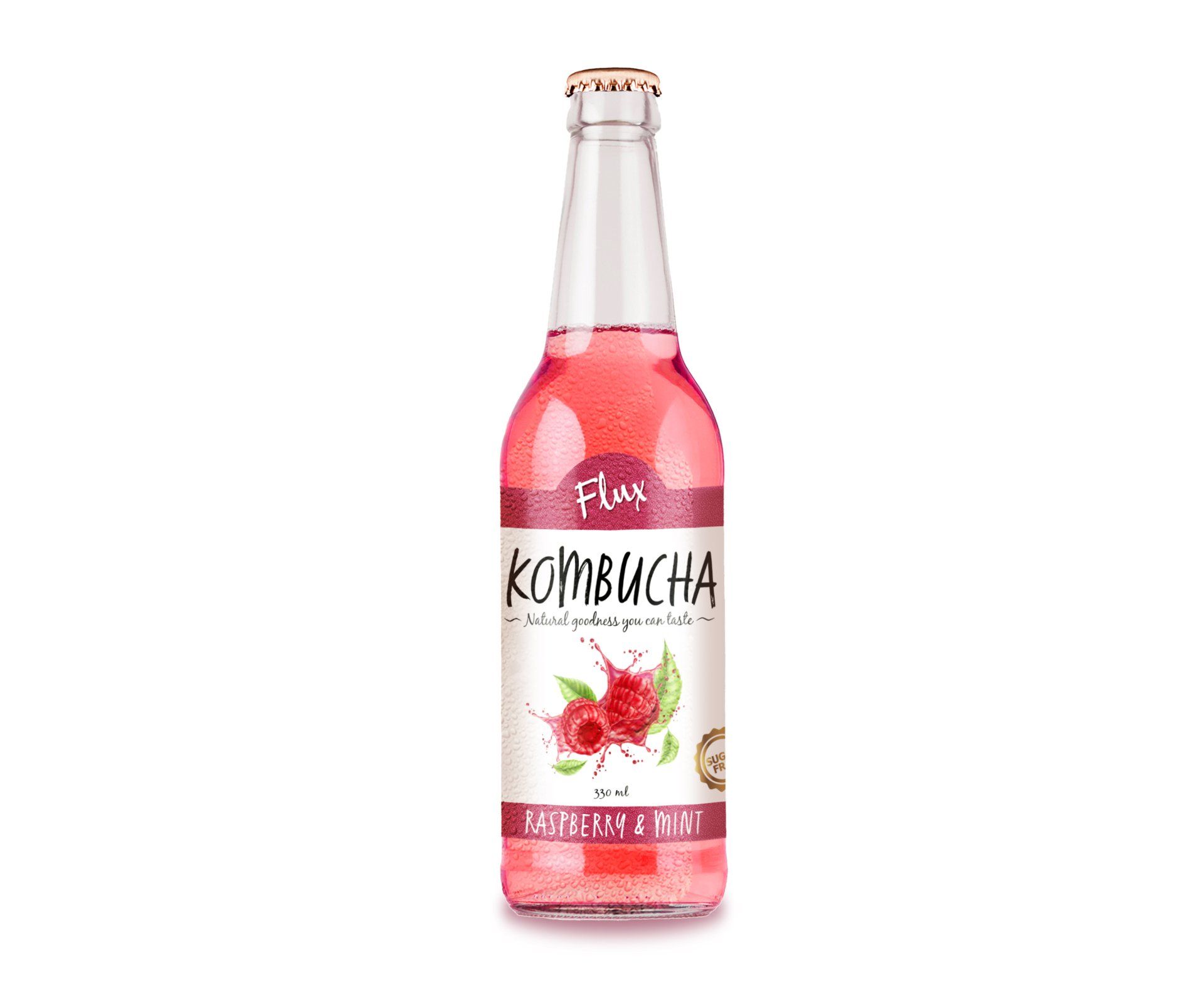
FLUX KOMBUCHA
Another great product label project that I completed is one for Flux Kombucha - a hypothetical Kombucha company that produces multiple flavours of Kombucha. For each flavour, a full label including Nutritional Information Panel and product information had to be created, as did cover graphics, llustration and design. Consideration needed to be given to the bottle, label stock and printing process and the artwork needed to be created in a way that was print ready with die line, bleeds and final layout.